Dark Mode UI Design – 10 Tips
Dark mode’s popularity has surged in recent years, driven by its appeal for reducing eye strain, improving battery life on certain devices, and providing a sleek, modern aesthetic that many users prefer. It became popular in 2018 following the release of Dark Mode on macOS Mojave.

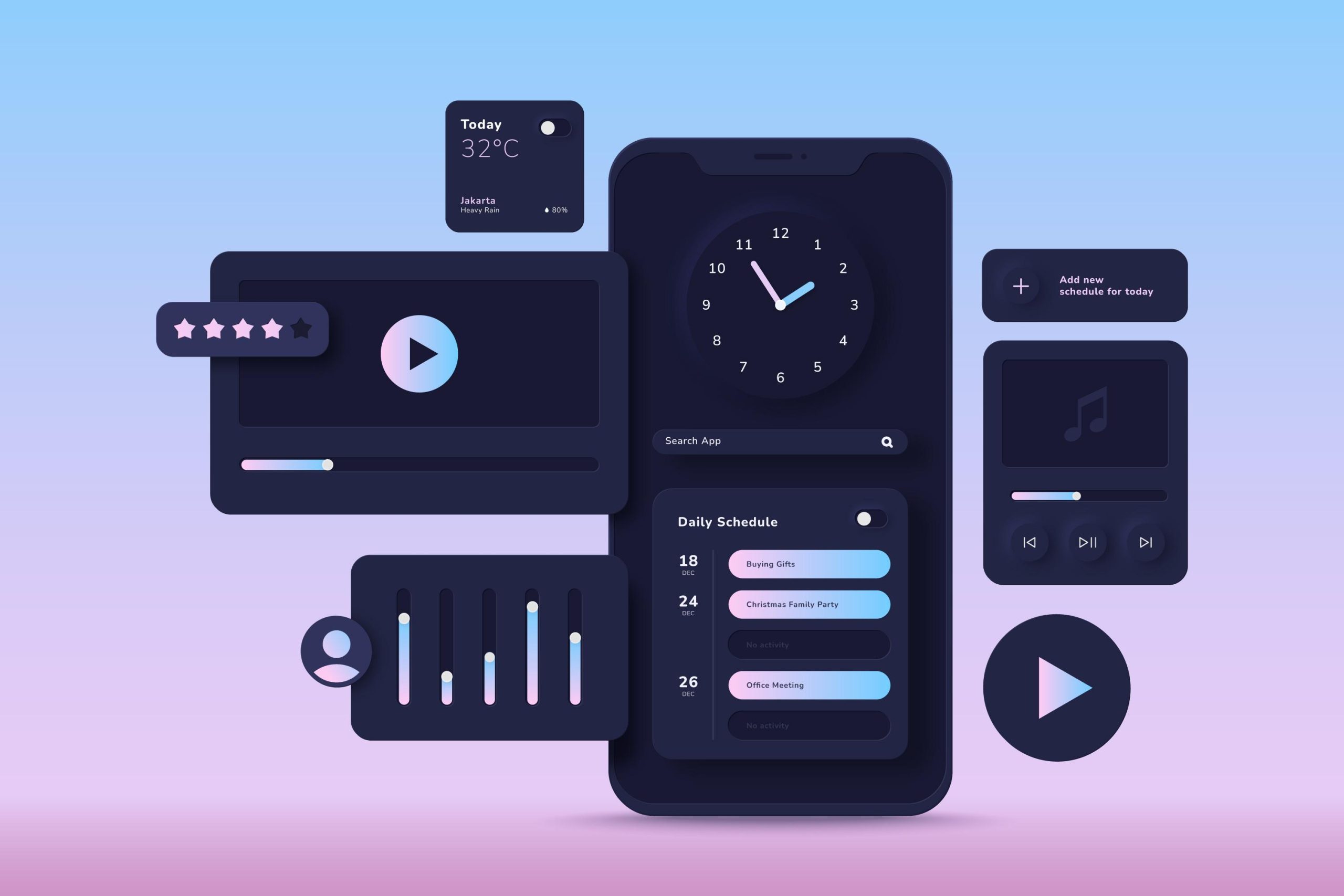
Due to the growing popularity of Dark UI Design, a growing number of programs now include a way to toggle between light and dark modes. Dark mode, characterized by dimmed, dark, and grey color themes for all user interface elements, offers a night-friendly design style. This is attributed to its use of darker colors, which reflect less light, providing a comfortable viewing experience, particularly in low-light environments.
Why use Dark UI?
The transition to dark mode offers a more comfortable viewing experience by reducing harsh light emissions from white backgrounds, potentially alleviating eye strain during prolonged device usage.
Switching to dark mode not only enhances the user interface but also conserves power, particularly on devices equipped with OLED screens. For instance, YouTube demonstrates up to a 15% increase in battery life savings when viewed in dark mode at 50% brightness compared to light themes.
Dark Mode UI Design Tips
Dark mode has become a popular feature for many applications and websites. It offers benefits like reduced eye strain, improved battery life, and a different aesthetic feel. But designing a good dark mode interface goes beyond just flipping the colors. Here are 10 tips to create a user-friendly and visually appealing dark UI:
- Embrace the Dark, But Not Pure Black: While dark is the goal, avoid using pure black backgrounds. Opt for dark grays or blues that are easier on the eyes and provide better contrast.
- Tame the Saturation: Saturated colors can be harsh in dark UIs. Use muted tones or desaturated versions of your brand colors to maintain readability and a balanced look.
- Don’t Fear White Text (But Use it Wisely): Pure white text can be too stark. Opt for off-whites, light grays, or adjust the opacity for different text elements based on importance.
- Be Your Brand, Even in the Dark: Your dark mode shouldn’t be a complete departure from your brand identity. Find ways to incorporate your brand colors in a subtle yet recognizable way.
- Think Beyond Inverting Colors: Inverting your light mode colors might not always work for dark mode. It’s better to design a separate color scheme specifically for the dark UI.
- Communicate Depth Without Shadows: Shadows, a common design element, can lose their effectiveness in dark interfaces. Explore alternative ways to communicate depth and hierarchy using subtle color variations or borders.
- Accessibility Reigns Supreme: Just like in light mode, ensure your dark mode UI meets accessibility standards for color contrast. Text should be clearly readable for users with visual impairments.
- Lighten Up Your Images (If Needed): Some images might appear too dark in a dark UI. Consider adjusting the brightness or contrast of images specifically for dark mode.
- Test, Test, Test!: Don’t just assume your dark mode works. Test it in various lighting conditions with real users to identify and address any usability issues.
- Give Users the Choice: While dark mode is popular, some users might prefer light mode. Allow users to easily switch between the two based on their preference.
Conclusion
In the realm of digital products, simplicity reigns supreme when it comes to achieving success with dark mode. This design approach thrives in minimalist content, social media platforms, and entertainment websites, where its sleek aesthetic enhances user experience.
However, implementing dark mode isn’t always seamless, particularly on data-heavy or text-intensive sites with diverse content types. Before rolling out any product, UX designers must meticulously test and analyze user feedback to ensure optimal performance and satisfaction across all interfaces.
Hopefully, this blog helped you understand if dark mode design necessary for your product’s design or not. Our team is dedicated to assisting you in making informed decisions about integrating dark mode into your product’s design.